Inside The Romans MENA: Three lessons from my first 90 days

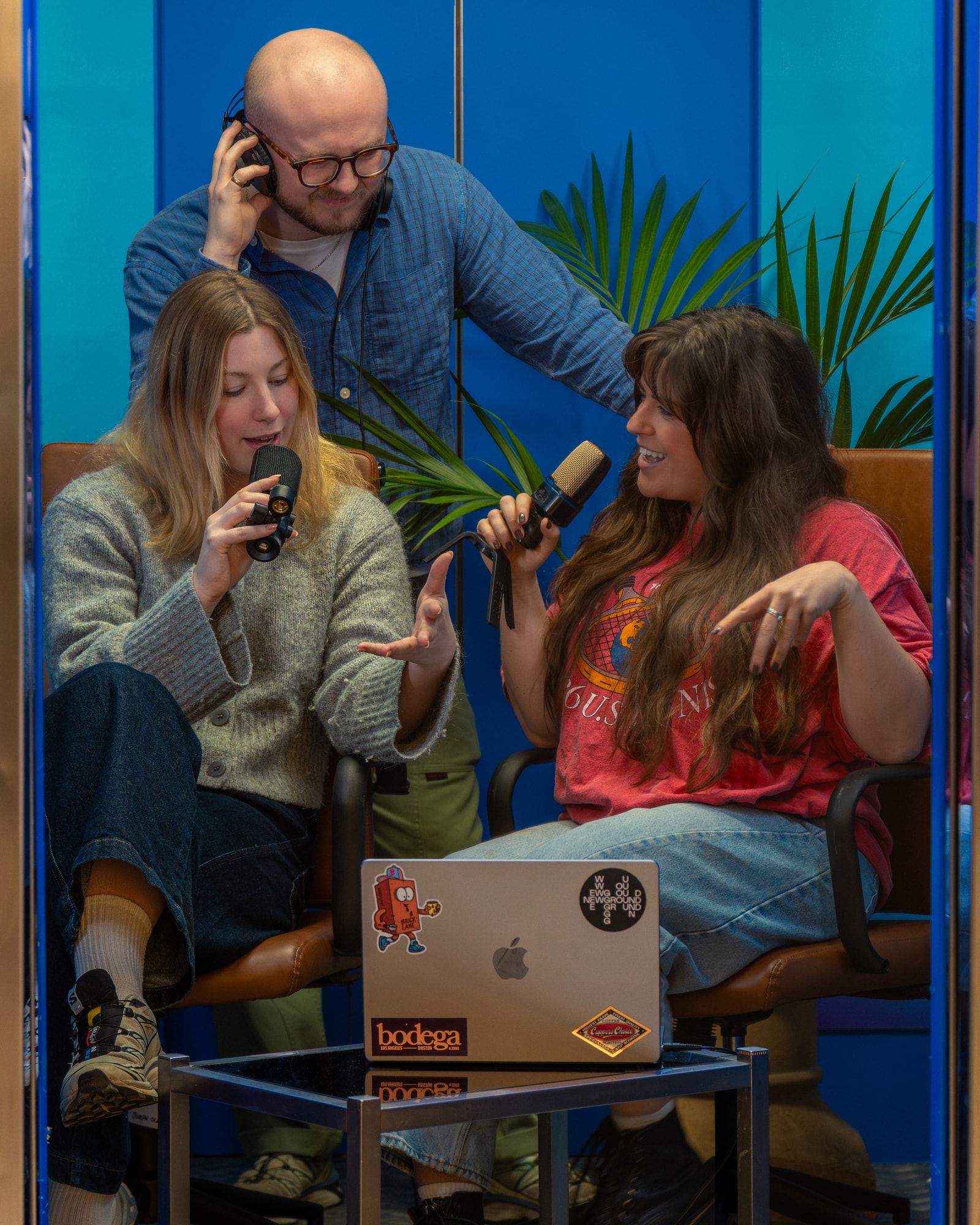
Holly and Georgia have won the Cannes Young Lions Design competition for 2026 and will be heading to Cannes to represent the UK.
The team beat 149 other entrants to win the Design Young Lions competition for the UK, with their campaign platform ‘Transparency Pays Off’.
The brief involved creating a compelling visual identity and creative platform for the News Alliance, aimed at encouraging advertisers and their agencies to actively support and invest in quality news. Their response was a brand identity built around the campaign platform “Transparency Pays Off”; a commitment to promoting The News Alliance’s firm stance on clarity, bringing trust and credible information into focus.
We had a little chat to trawl their brains for creative design ideas.
Holly and Georgia (H&G): We’ve always been drawn to design because of its ability to communicate ideas visually and connect with people on a deeper level. It feels like a universal language. One that can convey meaning instantly without needing words. For us, design is also a form of problem-solving, where we’re constantly finding creative ways to address everyday challenges through visual thinking.
What makes it even more exciting is that design is everywhere. From something as small as a sugar packet with your coffee to the magazines you read or the social apps you use daily, it’s all been carefully considered. Living in London and travelling more broadly, we’re constantly surrounded by inspiration, which continues to shape how we think and create.
G: I’m particularly inspired by the era when Peter Dixon joined the Sainsbury’s Design Studio. The use of large, bold typefaces paired with minimal product illustrations created a really striking visual language that still influences a lot of design today. It’s interesting how something as simple as a cereal box from that time can go on to inspire much larger, high-budget campaigns. I’m especially drawn to bold, minimal shapes and colour in print design, as well as hand-drawn typography and illustration, anything that feels tactile and moves away from purely digital work.
H: For me, the Oatly branding really stood out when it first launched. From the playful illustrations to the humorous tone of voice across the packaging, it felt fresh and distinctive. Their out-of-home campaigns were always eye-catching too, largely due to their confident use of bold typography. I’m particularly attracted to digital design that uses strong typographic statements, vibrant colour, and clever minimalism to create something impactful.
Interestingly, that’s why this project felt so different for us; working entirely in black and white pushed us into a very different creative space.
H&G: Recently, we’ve both been developing branding and visual assets for Papa John’s installations, as well as contributing to multiple projects for Heineken. We’ve also been involved in various aspects of The Romans brand itself - creating visual identities for different marketing campaigns and workstreams.
Day-to-day, our work at The Romans involves creating fully integrated 360 campaigns for global brands. This gives us the opportunity to work across a wide range of touch points and bring cohesive creative ideas to life at scale.
By Georgia Pizzala and Holly Stephens, Designers.